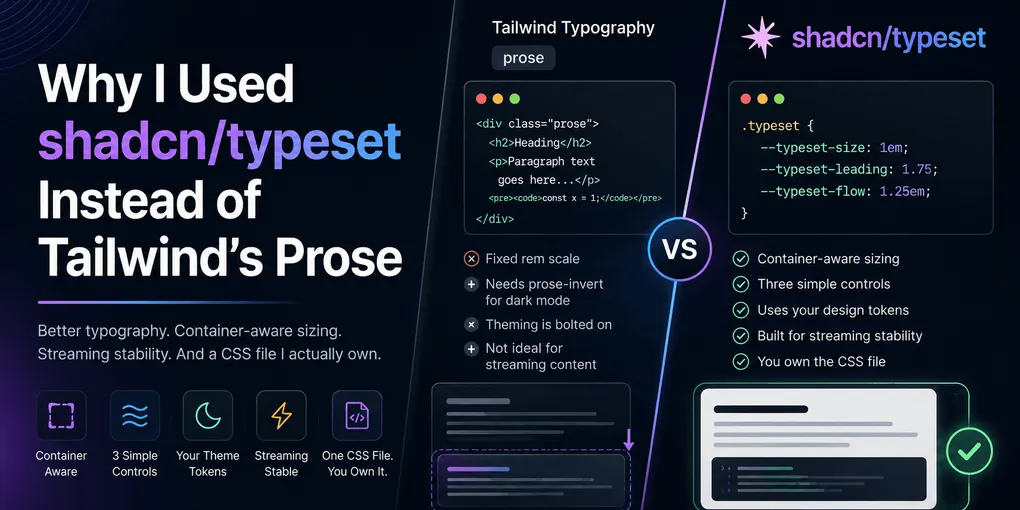
shadcn/typeset vs Tailwind's Prose
You render Markdown to HTML and get back unstyled <p> and <h2> tags. You need typography: font sizes, line heights, spacing between blocks, code block styling, table borders. The standard answer is @tailwindcss/typography and its prose class. Drop it on a container and your HTML looks like a blog post.
I used prose for a while making templates for Themefisher and working with various clients in Zeon Studio. It works fine for a blog. But I wanted typography that plugged into my theme tokens directly, a CSS file I could own and debug, and the option to use different presets if the site grows. That’s when I switched to shadcn/typeset.
What prose does well
Tailwind Typography is excellent at its original job: adding typographic defaults to raw HTML. You wrap your rendered content in prose and you get proper heading sizes, paragraph spacing, list indentation, code block styling, and a color palette that works in light and dark mode. For a simple blog, that covers it.
The plugin also introduced a useful pattern: using :where() to keep specificity low, so Tailwind utilities can override prose styles without !important. Typeset borrows this directly.
What prose doesn’t do
Prose is a solved problem for “one blog, one look.” Here’s what it doesn’t give you.
Fixed sizing. Prose uses a fixed rem scale: prose-sm, prose-base, prose-lg, prose-xl, prose-2xl. You pick a size and everything scales together. There’s no way to say “I want this block to follow its container’s size.” If you put prose in a sidebar or a chat bubble, the type doesn’t adapt. It stays at the size you chose, regardless of context.
Theming is bolted on. Prose gives you its own color variables. You can override them, but the scale is baked in. If you want a serif reading mode for one section and a compact sans-serif mode for another, you’re fighting the plugin rather than configuring it.
Streaming. If you’re rendering content that arrives incrementally, like from an AI chat or a live-updating markdown feed, adding a new block can cause earlier blocks to shift their margins. Prose uses :last-child and :has() selectors that change as content is appended. Every new block reshuffles the layout of what’s already on screen.
What typeset does differently
shadcn/typeset is not a Tailwind plugin. It’s one CSS file you copy into your project and own completely. You read every rule, override anything with a normal selector, and debug it in devtools without touching node_modules.
Container-aware sizing. Typeset sizes type relative to its container. Put it in a narrow chat bubble and the text gets smaller. Put it in a wide article and it scales up. On small screens, it bumps size slightly for readability. You don’t pick from a preset scale. The container determines the size.
Three controls. Instead of exposing dozens of variables for every typographic detail, typeset boils it down to three:
.typeset {
	--typeset-size: 1em;
	--typeset-leading: 1.75;
	--typeset-flow: 1.25em;
}
--typeset-size is the base font size. --typeset-leading is the line height. --typeset-flow is the vertical rhythm, the space between blocks. Everything else (heading sizes, list indents, spacing after a heading) derives from these three values. Change one and the whole document follows
Preset classes. You can define multiple presets in the same app:
.typeset-docs {
	--typeset-size: 18px;
	--typeset-leading: 1.9;
	--typeset-flow: 1.25em;
}

.typeset-chat {
	--typeset-flow: 1em;
	--typeset-leading: 1.6;
}
Then wrap content in the appropriate class:
<div class="typeset typeset-docs">...</div>
<div class="typeset typeset-chat">...</div>
One section gets roomy, long-form rhythm. Another gets tight, compact rhythm. Same stylesheet, same theme.
Your tokens, not its own. Typeset pulls colors, fonts, and border radius from your existing design tokens. Dark mode follows the same tokens your app already uses, so there’s no prose-invert to add. If you change your theme, typeset changes with it.
Streaming stability. Typeset was designed for content that gets appended. It avoids forward-looking selectors like :last-child and :has(). Spacing flows in one direction using margin-block-start only. Table separators sit on the cells being added, not on the row above. A new block adds its own space without restyling what came before.
You own the file. When typeset publishes an update, you diff the new file against yours and merge the changes you want, instead of waiting on a plugin release cycle.
How it fits this project
In this site, typeset handles blog posts and any rendered markdown content. The typeset-docs preset sets the fonts (Geist for body and headings, Geist Mono for code), the base size (18px), a generous line height (1.9), and the flow rhythm (1.25em).
.typeset-docs {
	--typeset-font-body: var(--font-geist);
	--typeset-font-heading: var(--font-geist);
	--typeset-font-mono: var(--font-geist-mono);
	--typeset-size: 18px;
	--typeset-leading: 1.9;
	--typeset-flow: 1.25em;
}
The blog layout wraps rendered content in:
<div class="prose typeset typeset-docs max-w-[42em]">
	<slot />
</div>
The prose class is still there for layout centering on the blog post container (margin: auto; padding: 1em). Everything else comes from typeset. The :where() pattern means Tailwind utilities still win when I need a one-off adjustment, without fighting specificity.
The tradeoff
Typeset is a newer, smaller project compared to @tailwindcss/typography, which has been around for years and is battle-tested across thousands of sites. If you need a quick, opinionated typography layer for a simple blog and don’t care about container-aware sizing or streaming stability, prose is the safer pick.
But if you need multiple typographic contexts in one app, want your typography to plug into your existing design tokens, or are rendering content that arrives incrementally, typeset solves problems that prose wasn’t designed to address. And you get to own the CSS, which after dealing with plugin version mismatches and node_modules debugging, starts to matter more than the features themselves.